I’m having a problem. My problem is that I can’t make a decision.
Well, that’s a little misleading. In truth, my problem is nailed very accurately by the commenters over at Cover Art Review today, where the subject of discussion is the cover for my novel Concerto.
I agree with them; the current cover is lovely. Gorgeous. It grabbed me the minute I designed it, and I never really considered any other cover afterward.
The problem? The current cover screams Literary Fiction to all who see it. Concerto is either romantic suspense or suspense–I’ve heard different opinions from different readers on where it falls–but it is clearly not literary fiction.
I know this is a problem. I’m not sure how big of a problem. Would a romantic suspense reader take a chance on a book with a cover like that? I’ve no idea.
Music is crucial to Concerto, though–I think it really does need to be reflected in the cover design somehow.
With that in mind, I have three other candidates. I even have printed proofs of each of these covers, and I still can’t seem to decide which would be best.
What do you think? The four contenders are below. Which cover works best for a romantic suspense about music and musicians?
The Current Cover:

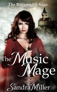
Prospective Cover #1–Red Satin:

Prospective Cover #2–Violinist, script font:

Prospective Cover #3–Violinist, casual font: